In the closing remarks of WordCamp US this past month, Matt Mullenweg addressed the next phase of Gutenberg development, Collaboration. In its Phase 3 conception, collaboration will be Gutenberg’s most widespread initiative so far. The plan is to address the WordPress admin outside of the block and site editor. Phase 3 will include changes to revisions, publishing workflows, the media library—and maybe most excitingly from a technology view—real-time editing and asynchronous collaboration inside of the editor (somewhat akin to a decentralized Google Docs).
But Matt also mentioned another area of focus. “We’re going to be redesigning the admin a little bit.”
Leading up to the release of WordPress 6.3 and WordCamp US, Matias Ventura, Gutenberg Lead Architect, posted a WordPress Make blog post about what a redesign of the admin could look like. The problem was articulated well and Matias’ prototypes and designs were stunning, modern, and ambitious. Which is what we want for ongoing admin development. But, if you browse through the comments of that post, you will see site owners, developers and designers pointing to problems in the admin—bloated admin sidebars, overblown settings pages, confusing bulk actions, competing plugin UIs to name a few.
The Customization Gap
This all reveals a major gap. A customization gap. The WordPress editor is simpler and more intuitive than ever. With the Site Editor, its surface area has broadened to include global styles and templates. But when it comes to customization outside of block-based themes and single posts, the admin doesn’t fully hold together, and the experience for site owners can be diminished. Reaktiv is often working inside of this space, trying to improve and bring together different parts of this customization experience.
We often find ourselves having to choose between building something custom or using a part of the admin we’re not even sure has a future in core. Over the years, we have turned to the Customizer, custom settings screens, and even built-in custom, JavaScript-powered dashboards to try and combine settings and data into something cohesive and intuitive.
What do I mean by customization? At Reaktiv, we often deal with sites that act more like platforms. Several sites working off of the same code and baseline, tied together by a design system, or an editorial team, or a multisite instance. As part of using their platform, our clients are customizing plugin options, importing data, configuring individual sites, and setting up ad and sponsor workflows, just to name a few. For most of our site owners, the work that takes place outside of the editor is all part of the core, everyday experience of managing a WordPress site. They might spend as much, or more, time in places where Gutenberg hasn’t been included as they do in places where it has.
And those are the parts of the admin that haven’t seen as much development in recent years, even as Gutenberg has rapidly advanced. The Customizer was first built into WordPress in 2012. We are very comfortable in it, and often use it in client experiences. We even have a former product built on top of it. But it has been half a decade since there has been a release focused on its improvement or development. MP6, the last major iteration to the WordPress admin is nearly a decade old.
A lot of what we build tries to address the problems that others pointed to in Mathias’ post. We often find ourselves having to choose between building something custom or using a part of the admin we’re not even sure has a future in core. Over the years, we have turned to the Customizer, custom settings screens, and even built-in custom, JavaScript-powered dashboards to try and combine settings and data into something cohesive and intuitive.
We’ve had our eye on the Site Editor for some time. And we’ve both used it, and taken inspiration from it, for the custom platforms that we’ve built. But there is still a gap between the needs of clients that manage large, enterprise level platforms, and the functionality of the current WordPress admin experience.
Evolving the Site Editor
And yet gaps create opportunity. One can imagine an immersive admin experience that prioritizes context over having everything available all at once.
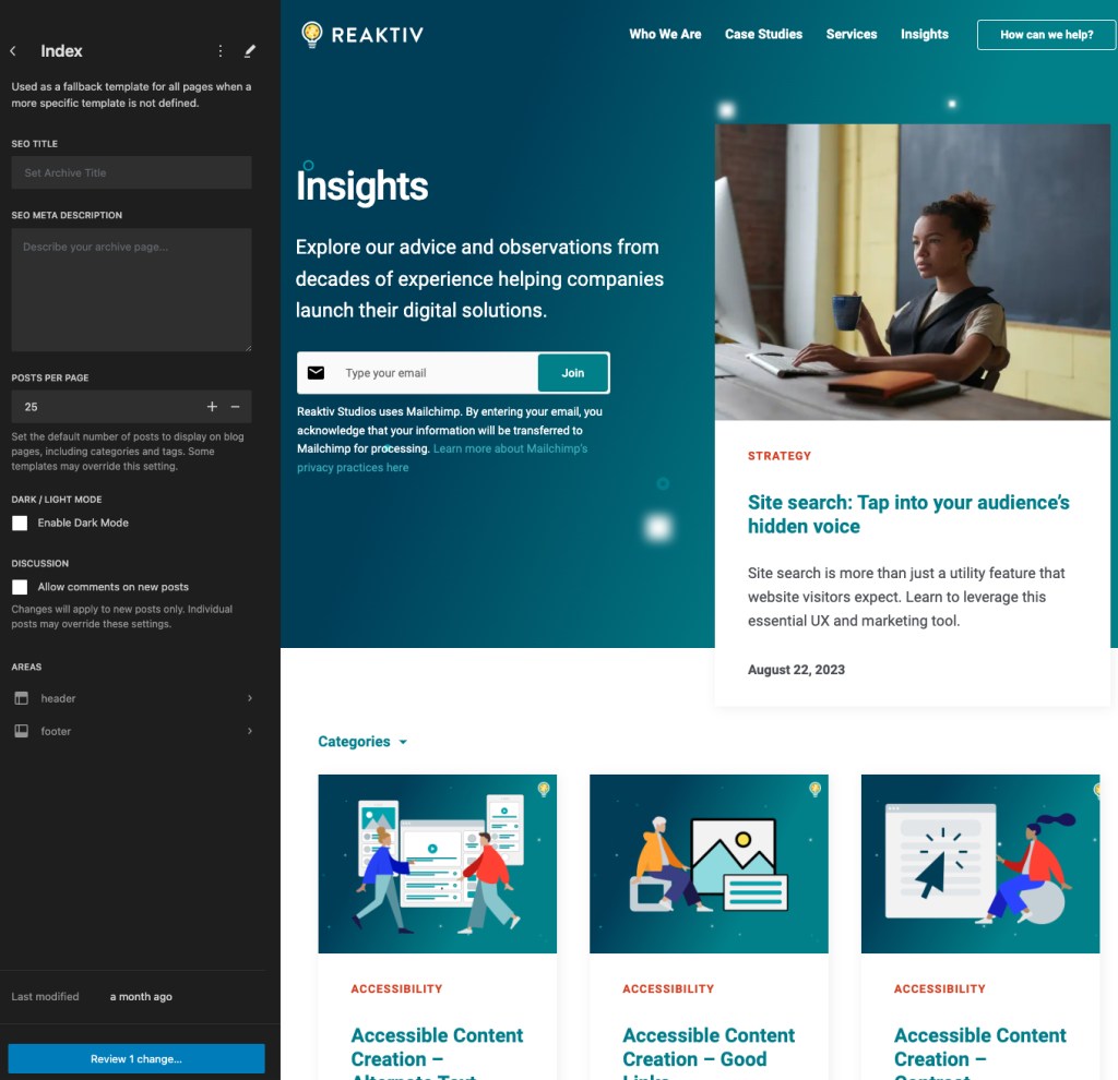
One of the things we find ourselves doing all of the time is using a combination of the Customizer and custom admin pages to group together options and theme modifications common to a single area of the site. When making changes to a site’s archives, for instance, you may want to be able to edit SEO based metadata, enable different layout styles, and set global options like posts per page, all in the same spot.
What if the Site Editor could unify that context? Let’s explore what this could look like.
Rather than see just the standard WordPress options, the Site Editor becomes a place where all of these options are combined. In addition to standard archive settings, there might be a few options from your SEO plugin to customize the metadata of the page, and a theme option to toggle Dark Mode on or off.
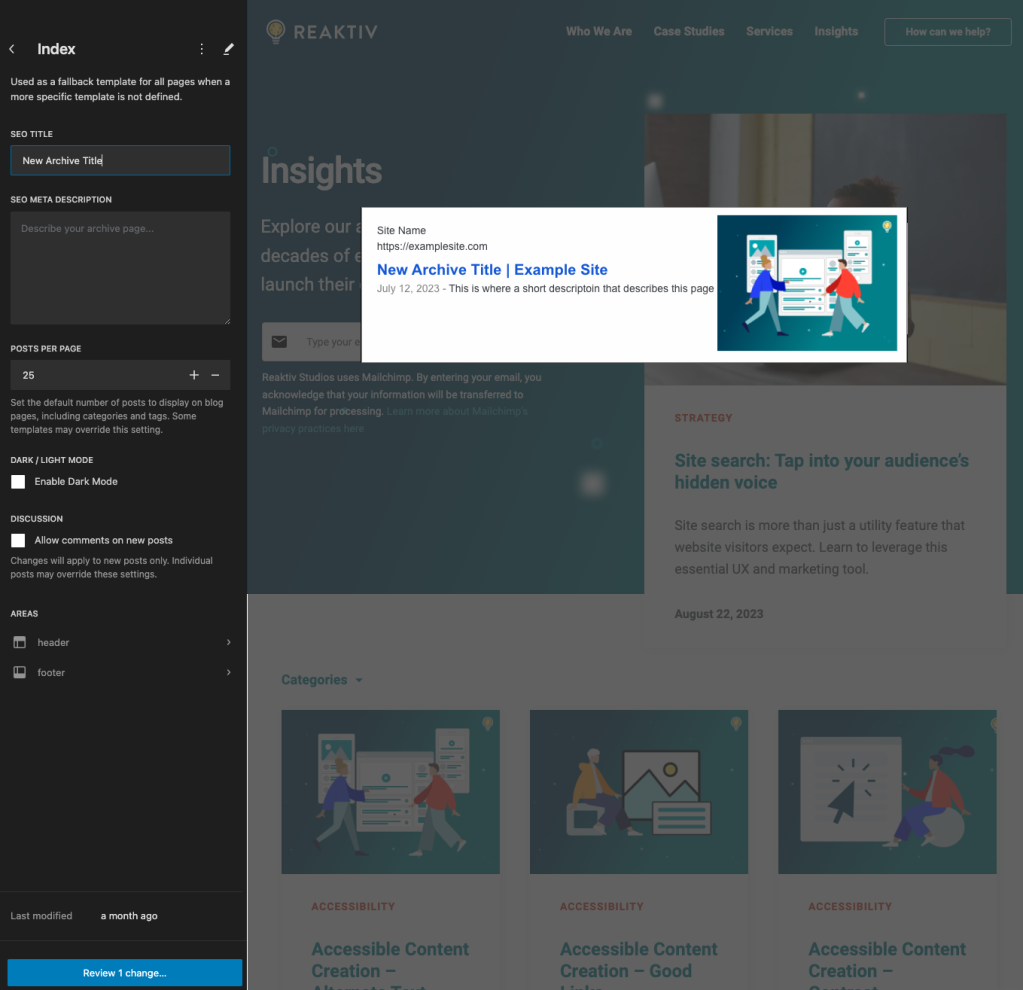
When you start editing an option, the admin becomes context aware. Type your SEO title and be immediately greeted with an SEO preview window, prompting the right visual context for that data.
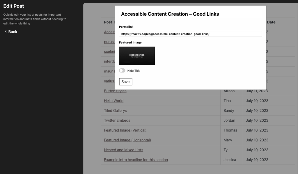
We can go one step further. The Quick Edit experience inside of the post lists screen can be helpful, but it is slowed down by the rest of the admin, and difficult to customize and enhance with different kinds of post data. It is typically useful only in the narrowest of cases.
The Site Editor could build on Quick Edit to create something snappy, and far more customizable. Viewing a list of posts in a certain post type can provide an interface that is easy to scan through, much like the post list today.
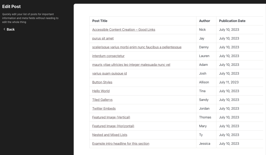
But if you hop into edit an individual post, you are met by a screen that contain a filterable, customizable subset of data that can be updated inline and saved, without ever needing to go to the Edit Post screen.
These are some use cases that I’ve been playing around with. But if you start to poke at the edges of the WordPress admin, you will find opportunities everywhere. And that’s clearly what the core team has begun doing.
Looking Forward
All of this is possible. The level of communication between components and the interactivity of the admin is at a place it has never been before. But what stands in front of us are not technical challenges, but challenges of standardization, backwards compatibility, and unified vision.
The trajectory of the core team clearly indicates a coming focus on the wider admin, the bounds outside of the editor. Already, some of the ideas coming out of the Phase 3 project are exciting and invigorating. This gives WordPress a chance to lead, and not follow. To innovate and rethink the way in which sites are managed, the way in which many sites work together.
At Reaktiv, this is an opportunity that excites us. In the next few months, it’s one that we plan to experiment with. We will be sharing some of these experiments and custom work along the way. And we hope to be a part of closing the customization gap.

